Pitch decks in 2025 demand strategic storytelling, data-driven design, and psychological insight. Investors see hundreds of decks; yours must grab attention, hold it, and deliver a compelling argument. This means every visual element, sentence, and slide must be chosen purposefully. In the sections below, we expand on the latest best practices and even challenge some “rules” to give founders the depth and nuance needed for world-class decks today.
Importance of Pitch Deck for Startups
Visual Design Psychology: Colour & Typography

Effective design goes beyond looking pretty; it guides investor focus and conveys emotion. Colour psychology and typography choices are subtle but powerful signals. Research shows that colour affects investor perception; for example, blue evokes trust and professionalism (favoured by tech and finance pitches), green suggests growth and health, and red can signal urgency or confidence. A data-driven approach: Use a consistent, minimal palette (often 24 core colours) so the deck feels cohesive. Harmonious colour schemes (analogous or complementary hues) keep focus on content and avoid cognitive overload.
Investors are humans first: use colour strategically. For example, a red “CTA” button can drive action, while green accents hint at growth or eco-friendly solutions. High contrast ensures readability (dark text on light background or vice versa). Align colours with your brand identity (if you have one) and with industry conventions: e.g., health-tech often uses greens, fintech leans blue. Avoid neon brights or clashing colours that distract. In short, design slides so they feel right: professional, energetic, or calming, depending on your narrative.
Likewise, fonts and typography carry weight. Choose legible, professional typefaces. Sans-serif fonts like Helvetica or Open Sans are modern and clean; serif fonts (e.g., Garamond) feel formal or luxurious. Stick to at most two fonts (one for headings, one for body) for consistency. Avoid novelty or “cute” fonts that reduce credibility.
Size and spacing are critical. Use large enough text so slides can be read at a glance, typically headline ≥32pt, body ≥1824pt. Adequate line spacing prevents dense blocks. A good rule: if you have to squint or the slide looks crowded, use bullet points or break into multiple slides. Test your slides on a screen and projector: what looks great on a monitor may blur at a distance. In summary, typography in 2025 is strategic legibility: it must reinforce hierarchy (big bold headings vs. smaller subtext) and ensure investors instantly get the message.
How Investor Expectations Have Evolved in 2025

Investor expectations in 2025 look very different from a few years ago. They don’t just want to fund promising ideas. They want to influence the direction of the world. That ambition sounds inspiring, but does it always lead to sound decision-making?
Let’s take a closer, more honest look at how these expectations play out.
Sustainability is now expected but still unevenly enforced.
ESG has moved from the sidelines to the centre. You’ll hear that climate action, workforce equity, and governance are the new minimums, and in many boardrooms, that’s true.
But let’s look closer.
Many ESG reports aren’t audited; some companies still treat these disclosures as marketing. There’s no single global standard, so comparisons are messy. Investors often talk tough on sustainability, but is their pressure consistent? Or does it rise when a company faces public scrutiny and fall when no one’s watching?
That’s the real question.
Profit with purpose is trending fragile.

You’ll hear a lot about “regenerative business.” VCs fund ventures that don’t just sustain systems but aim to repair them. On the surface, this sounds exciting.
But ask yourself: do these ventures scale?
When budgets tighten or public markets push for quarterly wins, purpose often fades. What looks like a movement might be a trend. Investors love a strong narrative. But will they back that narrative when trade-offs appear? That’s where most impact models are tested.
Speed is rewarded, but at what cost?
Startups are under pressure to move fast. Build. Launch. Iterate. Raise again.
And AI helps. Data dashboards allow real-time insights. Teams move quicker than ever.
But that speed comes with trade-offs.
Fast growth can overlook ethics. Burnout rises. Founders are pushed to make choices before thinking them through. There’s a difference between being agile and being reckless. Is speed always a strength, or sometimes a symptom of short-term thinking?
Data matters, but not all metrics are meaningful.
Gut instinct has taken a backseat. Everyone wants numbers. Investors want to see KPIs, traction, forecasts, and benchmarks.
But not all metrics reflect impact.
Is customer churn more important than cultural loyalty? Are we measuring relationships or just transactions? The data-driven approach is helpful but not always complete. What gets measured often shapes decisions, so what are we leaving out?
Leadership is praised but still judged by optics.
Empathy. Transparency. Vulnerability.
These words appear in pitch decks and interviews. Investors claim to seek founders who lead with integrity. But in practice, charisma still carries weight.
In high-pressure settings, how do we distinguish real character from well-coached performance? Leadership is hard to measure but easy to create, making it challenging to separate sincerity from storytelling.
If you’re building something today, ask yourself:
- Are your ESG efforts consistent and verifiable?
- Can your purpose survive pressure?
- Does your speed serve long-term goals?
- Are you measuring what matters?
- And are you being genuine, or just rehearsed?
Investors may say they want vision, values, and velocity, but the reality is more complex. The founders who thrive will be the ones who see that complexity and choose clarity over hype.
Masterful Storytelling and Narrative

A pitch deck is a story, a problem-solution journey, not a dry report. The narrative structure must engage and inspire, while remaining credible. Think of your company as the hero or guide who overcomes a powerful villain (the problem or market pain). Many successful decks follow a classic arc: intro (hook), problem (the villain), solution (the hero’s tool), benefits and proof, team (the heroes), then vision and ask.
Narrative Structures & Examples
Employ familiar storytelling templates to make your pitch memorable. For instance, the Hero’s Journey frames your customer (or you as the founder) overcoming a challenge with your product as the magical aid. The inverted pyramid (start broad, narrow to specifics) or concentric circles (show ecosystem centre to edges) can also help structure the flow. The key is to connect emotionally before diving into data: start with a vivid scenario or statistic that immediately shows why the problem matters.
Good vs. Forgettable Narrative: A clear example comes from investor advisor Ravi Warrier. A poor problem slide reads, “Every smartphone is too expensive,” with a generic gadget icon that is vague and uninspiring. A strong narrative instead might say: “Each year, 50 million tons of e-waste from smartphones end up in landfills, and 40% of users buy new phones just for an upgrade. What if your phone evolved with you? This paints a picture: personal cost + global stake, grabbing attention. Similarly, don’t just say “Our solution is great.” Show the immediate emotional relief your solution provides, your “superhero moment” as in the Warrior’s example of Superman saving a child.
Common Storytelling Mistakes
Founders often trip up by making their stories either too generic or too long. A common red flag is beginning with product details or feature lists instead of context. Investors don’t invest in features; they invest in transformations. Don’t lead with “Our app does X.” Instead, start with why there is a significant change in the world and earn the right to talk about the product.
Other pitfalls:
- Clichéd buzzwords: Avoid generic taglines. “Revolutionising smartphones” or “innovative synergy” are forgettable. Be specific and human (e.g., “What if your phone could evolve with you?”).
- Data dumps or fluff: Overloading slides with technical jargon or huge paragraphs kills narrative flow. Storytelling in a deck should complement data, not bury investors in it. If you need any backstory slides, break them into bite-sized points. Remember, a deck’s job is to get a meeting, not to explain every detail. (As MassLight warns, a pitch deck primarily needs to capture interest quickly, saving the deeper story for face-to-face.)
- There is no clear thread. Each slide should logically follow. The team slide, for example, isn’t just a LinkedIn bio; it should show why this team is uniquely suited to solve the story’s problem based on lived experience.
Crafting a compelling narrative means weaving emotion and logic. Use storytelling elements (characters, stakes, conflict resolution) but always tie them to real data or proof. For instance, after a story-driven problem slide, follow with a solution slide that visually and succinctly “swoops in” as the hero, with a concrete example or demo snippet (even better, a short animation or product video to illustrate it)
Slide-by-Slide Expectations (and Mistakes)

Different slides serve different roles. Top-tier investors look for clarity and substance on each. Below is a slide-by-slide guide to what to include and what to avoid.
Slide | Investor Expectations | Common Mistakes |
Cover/Intro | Grabs attention with a strong tagline, the company name/logo, and a compelling visual. Sets a tone and curiosity, e.g., with an evocative question or bold statement. | Boring titles (“XYZ, Inc.”) or generic visuals. Vague buzzwords (“revolutionising tech”). |
Problem (Pain Point) | A vivid, relatable problem scenario with real data. Highlight who’s hurt and how badly (statistics, human story). Show urgency and emotional stakes. | Too abstract. (“Everyone hates tech.”) or data-less claims. Using jargon instead of humans. |
Solution | Provide a clear explanation of how your product/service solves that problem uniquely. Benefits-focused: what relief or value does it deliver? Ideally, show a demo or example. | Feature dump. (“It’s customisable.”) without context. No proof of uniqueness vs. alternatives. |
Market Opportunity | Credible TAM/SAM estimates with context: define the customer and why the market is significant for you. Show trends or shifts that are making this market ripe. | Stat bomb. (“$100B market!” with no context). Neglecting how your specific segment or timing matters. |
Business Model | How do you make money (pricing, margins, scalability)? Clear revenue streams. Evidence (if any) of current revenue or pilot results. | Vague or overly complicated models. Leaving out key assumptions. |
Product/Tech | Briefly demo product or tech. Highlight standout features or IP. Use screenshots or short videos. Emphasise what makes it hard to copy. | Showing the engine before the car: diving into UI diagrams before investors see the need. |
Competition | Honest landscape: list main competitors and your differentiators. Show you understand alternatives and why you can win (better tech, team, or cost structure). | “No competition” claims or ignoring indirect rivals. A one-sided graph that exaggerates your strength. |
Traction/Validation | Concrete metrics (users, revenue, growth rates), customer logos, testimonials, and pilots should provide objective evidence that you’re solving the problem. Investors want proof of momentum. | No data or just vanity metrics. Or overstated/uncorroborated claims (which kill credibility). |
Team | Key members with relevant experience. Show “superheroes” with complementary skills who’ve done it before. Connect backgrounds to the mission. | Listing past titles without context, Vague taglines (“visionary leader”) that say nothing. |
Financials | 3-5 year projections with assumptions (top-line revenue, key costs). Include at least revenue, gross margin, and burn rate. Realistic, not fantasy numbers. | Unrealistic forecasts or slides jammed with fine-print tables. Sandbagging (no numbers) or “make it up” projections. |
Ask/Closing | State funding needs (amount and use of funds) or next steps. Provide your contact info. End on a confident note or call-to-action. | Ending abruptly with no clear “ask” or CTA. Leaving out the ask (contact details) entirely. |
A well-designed table like the above (expanded with details) makes each slide’s purpose explicit. For example, if an investor sees your market slide with a pie chart saying “$X billion” with no story, they’ll mentally check “red flag, what’s your slice?”. Conversely, a slide that ties TAM to your unique angle (“shift in technology/social trends now lets us capture this market”) earns their nod.
Investor expectations by slide: In addition to the above, know what specifically your audience wants:
- Angels tend to focus on the story and the team. To impress them, companies invest in intuition and mission alignment, emphasise personal passion, show product demos or prototypes (making them feel the vision), and throw in credible metrics or logos as social proof. A logo of a known partner or a user growth chart instantly builds credibility with angels.
- VCs (Seed to Series A) want rapid scalability: large markets, product-market fit signals, and early traction. They look for a balance of narrative and solid data. For Series B+ investors, emphasise traction, unit economics, and plans to dominate a defined segment. Address risks and show milestones met.
- Corporate and strategic investors focus on synergy. Tailor your deck to show how you fit into their ecosystem, e.g., by highlighting IP or channels relevant to them. But be cautious: don’t reveal proprietary details until an NDA is signed. Corporate partners may worry you’re giving them intel.
By meeting these slide-by-slide expectations, you demonstrate discipline and understanding. Use visuals (charts, icons, photos) to make each slide feel rich yet uncluttered. A good practice is to include one key message per slide, supporting evidence, or a graphic. Keep content scannable and purposeful.
Multimedia Elements: Beyond Static Slides
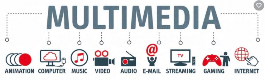
Modern decks increasingly leverage video, audio, and interactive features to engage remote or in-person audiences. But multimedia must be used judiciously. Research indicates audiences retain information better when multiple senses are engaged, but only if done well.
Video Pacing: A short, polished video (3090 seconds) can be powerful for demos or founder intros. But keep it tight; investors’ attention is finite. Break longer videos into chapters or add chapter markers; never auto-play at full volume. Use narration or captions so the message isn’t lost if played without sound.
Audio Cues: Subtle sound effects (like a gentle whoosh for slide transitions or a brief clip of customer praise) can create impact, but avoid gimmicks. The audio level must be balanced between surprise and loud noises. Music can set the mood but should not distract; ideally, it’s a low-key background under a voiceover. If using voice narration, speak clearly with a varied tone to keep energy up.
Interactivity: In virtual pitches (Zoom, Notion, etc.), interactivity can shine. Embed short Loom or Vidyard videos and clickable charts (e.g., in interactive PDFs or Notion toggles) so investors can explore details independently. For example, use toggles to let viewers reveal deeper data on demand, or include a link to a 3D product view. This shows you’re forward-thinking. Ensure you coach investors on any interactive elements (“click here to see our dashboard,” etc.).
Best Practices:
- Test Everything: Before sending or presenting, run through the deck on different devices, projectors, and internet connections. Multimedia often breaks in unfamiliar setups.
- Accessibility: Always have a fallback. Your slide should make sense if a video or sound fails (e.g., include text captions).
- Moderation: One deep dive or clip per slide deck is enough. Overloading multiple video/audio pieces can slow the pitch and annoy viewers. Use multimedia to enhance (emotion, demonstration) clear messaging, not replace it.
By 2025, pitch decks will be fluid in format. Some founders even use animated presentations or web-based decks, but the core is the story and data. Multimedia should serve that story, not overshadow it.
Contrarian Perspectives & When to Break the Rules
We’ve emphasised proven best practices, but sometimes breaking the rules creates an edge. It’s important to know when convention fails.
- Too Minimalist: Minimalist design (lots of white space, few words) is trendy and reduces cognitive load. However, it can fail if your topic is complex and investors need details to trust you. A minimalist slide might undersell credibility. You might need more diagrams or explanations for a deep-tech or biotech product, even if it feels “busy.” In those cases, innovate by layering, e.g., a high-level summary slide plus a hidden second layer (via handout or follow-up materials) with details.
- When Storytelling Backfires: Good storytelling connects, but too much story in the deck can backfire. If you make your pitch “novel-like” with multiple narrative slides and leave out precise numbers, time-strapped investors may call it fluff. Also, overly dramatic narratives without proof can raise eyebrows. Always tether your story arcs to solid evidence. If a story angle (like a founder’s emotional origin) doesn’t reinforce the business case, cut it from the deck and save it for personal chats.
- “Breaking the Template”: Following a classic slide order is safe, but occasionally it pays to shake things up. For example, if market dynamics change overnight, you might start with a “macro trends” slide before the problem. Or if your product is highly visual (e.g., an AI art tool), an early slide might be a quick gallery. The key is alignment: break format only if it amplifies your core message, and make sure the flow remains logical. One deck author cautions that too creative can confuse investors because VCs often prefer familiar structures. Use such “designful” deviations only with a very good reason.
- Rule of 10 Slides: Some famous advice suggests ~10 slides for conciseness. This is generally smart; brevity shows discipline. But do not cram 20 slides into 10. If a topic needs more slides (e.g., complex regulations, many customer segments), it’s better to have 1215 clear slides than 10 overloaded ones. Just be sure the extra slides add value, not filler.
In summary, contrarian moves should be deliberate. Always ask: Does this serve my story or investor understanding, or am I just doing it for flair? Good pitch decks meet expectations in unexpected ways; great decks sometimes defy expectations when the data/story calls for it.
Tailoring Your Deck: Angels, VCs, and Corporate Investors

Not all investors are the same. Your deck should reflect who you’re pitching:
- Angel Investors: Angels often bet on people and vision. They invest their capital on a gut feeling. So your deck for angels can afford to be more narrative-driven and personal. Emphasise the mission and “why” let them feel the passion. Include plenty of product images or demo links so they can experience what you’re building. Angels also love concrete evidence: highlight any traction (early users or pilots) and notable testimonials. Logos of early customers or partners are gold. Show logos of any notable past backers or advisors; seeing that other savvy people are involved reduces an angel’s perceived risk.
Key takeaway: Strike an emotional chord (vision, mission) plus credibility (metrics, social proof). - Venture Capitalists: VCs think systematically. For pre-Seed to Series A VCs, focus on market size, business model, and early traction. Data or realistic assumptions should back every claim. For later-stage VCs, shift towards demonstrating scale: unit economics, process improvements, and a clear path to profitability or exit. Structure your slides to address the typical VC due diligence: big market, unique advantage, execution plan, and exit potential. VCs often expect slides on competition, financial projections, and risks/mitigations that angels might skip. Include charts or citations for market trends (for example, use credible market reports to justify TAM).
Key takeaway: Be analytical and thorough. Show you’ve done the homework investors will do. Use graphs or benchmarks to compare yourself to industry standards. - Corporate/Strategic Investors: Corporations want to know, “How does this fit with what we do?” Tailor your deck to highlight strategic fit. For example, if you pitch to a healthcare conglomerate, emphasise how your solution opens new markets or complements their pipelines. Focus on sections like your IP portfolio, proprietary partnerships, or distribution channels that would benefit them. However, protect your secrets: don’t overshare confidential details without an NDA. A slide framing “collaboration opportunities” can be helpful.
Key takeaway: Speak their languages, “startup hype,” and more industry alignment. Build trust by acknowledging you’ll share more under NDA and referencing joint opportunities.
The same core deck can resonate in multiple contexts by adjusting tone and emphasis for each audience. However, the universal principles of clarity, honesty, and a strong storyline must always be maintained.
Pitch Deck Agencies & Experts: Good vs. Great (Red Flags!)

Many founders turn to professional agencies or consultants to polish their decks. But not all experts deliver the same quality. Here’s how to distinguish good agencies from great ones and warning signs to watch:
- Good Agencies: They provide clean, appealing visuals and layouts. They may have a template or style guide and can quickly execute your instructions. A good agency knows common slide structures (problem, solution, etc.) and can make sure your slides aren’t garishly formatted. They will work on bullet points and graphics you supply and often promise a fast turnaround.
- Great Agencies: Beyond design, great agencies are strategic partners. They will dig into your business, asking detailed questions about your model, market, and goals. They understand investor psychology and narrative craft, not just aesthetics. Expect them to challenge you on unclear points (“How do you eat competitor X?”) and help refine your story. They often have a track record of decks that raised money, and will cite examples or case studies. Great teams typically blend pitch coaching with design; they might suggest judiciously rearranging slides for impact or using interactive elements. They often specialise in an industry or know current trends.
In essence, good = looks good; great = looks good and convinces investors. - Red Flags When Hiring:
- Overemphasis on Design Alone: If an agency brags, it will make your deck beautiful, but it doesn’t discuss the business model or narrative. Be wary. A shiny deck with weak content still fails investors.
- No Portfolio or Vague Claims: Always ask for examples of decks they’ve built (especially for startups that raised funds). Take heed if they stall or only show “case studies” without real context.
- Rigid Templates: Agencies that only offer cookie-cutter templates may deliver fast, but won’t tailor to your story. If they say “everyone uses this slide order exactly,” question their flexibility.
- Too Good to Be True: Beware of grand promises (“we guarantee funding”). Legitimate agencies will improve presentation quality but won’t promise investment.
- Poor Communication: Note their responsiveness during your initial contact. If they’re slow to reply or don’t listen to your needs, it won’t get better later. Good collaboration is key.
- Hidden Costs: Watch for unexplained fees or ambiguous scope. A red flag is an agency that quotes a very low price but then upsells “essential” extras.
- What to Look For (Checklist): As Superside advises, choose an agency with a strong portfolio, relevant industry experience (or willingness to learn), clear communication, and a process that fits your timeline. The agency should ask about your audience and goals upfront. Expect them to sign NDAs or share best practices on confidentiality if needed.
In short, the best pitch deck experts act like co-founders: they care about the business, not just the slideshow. If an “expert” seems more interested in flashy animations than your market size or traction, you may need to shop around.
Conclusion
A standout 2025 pitch deck marries insightful content with impeccable design and storytelling. It uses colour and fonts to nudge emotions and clarity, weaves a narrative investors remember, and treats each slide as a strategic message. It leverages multimedia smartly and adapts to each investor audience. And behind it, a great founder (or agency partner) has factored in conventions and contrarian moves.
As detailed above, you ensure your pitch deck does more than sit quietly in an inbox by deepening your understanding of visual psychology, narrative structure, slide requirements, and audience nuances. It commands attention, inspires confidence, and earns that crucial meeting.