
A sales deck is your visual sales pitch, a carefully crafted slide presentation that guides prospects through your offering. It’s not the same as a pitch deck for investors; instead, it’s aimed squarely at buyers. A sales deck answers the question “what is a sales deck?” by putting your solution’s story on slides: you explain the problem, show how your product solves it, and persuade customers to act. In practice, a sales deck enhances your pitch with imagery and concise text; essentially, “your sales deck is your story”. A strong deck makes you look prepared and gives prospects the information they need to say “yes”.
What Is a Sales Deck?
Put simply, a sales deck is the presentation you use to pitch your product or service to potential customers. It usually lives in PowerPoint, Google Slides, or a similar tool, and it guides your audience through your sales story. A good deck provides a structured overview of your offering, highlighting value propositions and key selling points so your prospect understands why they should care. Think of it like a visual script: instead of just talking through your features, you show compelling slides reinforcing each point. As Zendesk notes, your sales deck enhances your pitch with visual aids that tell your company’s story.
Crucially, a sales deck isn’t about raising money; that’s what an investor pitch deck is for. A pitch deck targets VCs with charts on revenue and growth, while a sales deck targets customers with solutions to their problems. Slidebean explains that “rather than pitching at VCs and potential investors, a sales presentation is aimed at buyers”. In other words, your audience is different: with a sales deck, you want customers to buy; with a pitch deck, you want investors to fund you. As DealHub puts it, “a sales deck is a presentation designed to pitch a product or service to potential customers”, focusing on features, benefits, and how the offering solves problems.
Sales Deck vs. Pitch Deck: Are They Different?

Yes. While the terms sometimes overlap, a sales deck and pitch deck serve different goals. Your sales deck speaks to end-users or clients, zeroing in on pain points and solutions. Your pitch deck speaks to investors, emphasising market size, financials, and business model. DealHub sums it up: a sales deck “aims to sell products or services by highlighting features, benefits, and addressing customer needs… driving immediate action from the customer.”
In contrast, a pitch deck targets investors with the broader story of the business (financials, market potential, etc.). Slidebean adds that a sales deck is for “someone who will hopefully buy your offering” not “you, funding seed”.
In practice, this means your language and focus shift. With a sales deck, you might say, “our customers save 30% of their time using X,” and show logos of happy clients. With a pitch deck, you’d discuss “we project 10x growth in 5 years” and show revenue charts. They can look similar visually, but remember that sales pitch examples for customers should speak to customers’ problems, whereas pitch deck examples for investors speak to valuations and scalability.
Why a Great Sales Deck Matters
A well-crafted sales deck can make or break a meeting. It’s often your first impression and your leave-behind collateral. According to industry research, 57% of buyers say sales teams seem underprepared in early meetings. A polished deck goes a long way in fixing that: “Sales decks make you look more prepared and competent,” helping you win trust before you even open your mouth. Plus, humans process visuals much faster than text, up to 60 00 times faster according to one source, so the right image or chart can hook your audience immediately.
Another big reason: a deck serves as a leave-behind tool. Once the meeting is over, your deck can stay with the prospect. As DealHub notes, “a well-designed sales deck can be left with the prospect as a reference… [keeping] your product top-of-mind as they move through the buying process.”. In other words, each slide reminds you why your solution matters. With a clear CTA slide at the end, the deck also nudges them toward next steps (like scheduling a demo or starting a trial) even after you’ve left the room.
First Impressions Count
The first few slides in your deck set the tone. A professional, on-brand slide instilstime confidence; a messy one can kill trust. That’s why it pays to open strong. The cover slide and intro should immediately establish credibility and relevance. For example, start with a bold or startling statement highlighting a problem your audience cares about. As one expert put it, if your prospect sees your Problem slide and thinks “I don’t have that problem,” then you’ve at least saved both sides time. Ideally, your opening slides create a “common perspective” with your prospects by articulating the significant change or issue that affects them.
Consider how Snapchat opens its ad deck with a dramatic claim: “Snapchat is the best way to reach 13-34 year-olds.”【50†】. That hook instantly communicates relevance (it’s about reaching youth) before a single feature is mentioned. Similarly, DocSend recommends starting a deck by framing a major shift in the world, for instance, the rise of online research or digital content consumption, rather than diving straight into your product. This narrative context piques interest and primes prospects to want the solution you’ll reveal next.
Stories Sell, Not Stats
No one wants to sit through 20 slides of dry bullet points. People remember stories, not facts alone. This is a core principle of selling: weave a narrative through your deck. As DealHub explains, “You could rattle off features and benefits all day, but KPIs (even great ones) aren’t likely to make an emotional connection with your audience. Humans are naturally drawn to stories… a shift from monotony to engaging narrative leaves a lasting impression.”. In other words, facts establish credibility, but stories create connection.
Techniques for storytelling in a deck include using customer scenarios, analogies, or case studies that frame your solution. DocSend puts it bluntly: “People love stories. Stories seize and hold our attention and even change how we behave.”. So instead of presenting a laundry list of features, narrate a transformation: “Here’s what life looks like before our solution, and here’s how it looks after.” When numbers are needed, sprinkle them in to support a story (for example, a case study showing a “30% boost in efficiency”), rather than letting stats dominate the slide. DealHub aptly notes that “numbers may impress analytical thinkers, but they won’t trigger an emotional response… Balancing stats with stories brings value to life.”. By prioritizing narrative, your deck becomes memorable and persuasive.
Core Elements of a Winning Sales Deck

Every great sales deck follows a structure that tells a story from problem to solution. Here are the key components to include:
- Hook Them Early (The Introduction)
Start with a slide (or two) that grabs attention. This is where you introduce yourself and set the stage. Make it customer-centric: mention the industry, job title, or challenge you’re addressing. Use an anecdote, provocative statement, or big-picture trend to spark interest. For example, DocSend recommends first highlighting a broad shift in the industry (what Andy Raskin calls the “big change”) instead of pitching your product immediately. This kind of opening slide connects with the prospect’s reality. Snapchat’s opener (“best way to reach 1334 year-olds”【50†】) is a perfect model: it states a benefit that matters to marketers, not a feature of Snapchat’s app. - Define the Problem Clearly
Next, spell out the pain point or problem your audience faces. This isn’t about bragging on your product but showing you understand the prospect’s world. As First Round Review advises, “Starting with the ‘Problem’ section is helpful… If [the prospect] says ‘I don’t have that problem,’ then you’ve saved time.”. In practice, your problem slide should concisely state the core issue (e.g. “Sales reps waste hours on manual quoting,” “Scaling customer support is too expensive,” etc.) and ideally include evidence that it’s real. You can cite industry stats, trends, or a short customer anecdote to validate the widespread problem. (For example, showing analyst data on a market gap or a quote from a frustrated customer.) This builds urgency: you want the prospect nodding, “Yes, this is exactly what we deal with.” - Introduce Your Solution
Once the problem is clear, it’s time to present your solution. Introduce your product or service in a way that directly addresses the issue you just described. Keep it focused and jargon-free. Clearly explain how it works at a high level and why it’s unique. According to DealHub, this “Solution Overview” slide should “highlight your solution’s unique approach and effectiveness, making it stand out from alternatives.”. For example, you might say, “Our platform automates X in three clicks,” or “We use AI to analyze data so your team can focus on strategy.” Use visuals, such as screenshots or icons, to illustrate your solution. This is not the time to list every feature; just show the core mechanism or workflow that solves the key pain point. - Showcase the Value (Benefits Over Features)
Prospects want to know “What’s in it for me?”. Instead of drowning them in feature specs, emphasise the benefits and outcomes. DealHub advises distinguishing between features and benefits: “features describe what your software can do, but benefits tap into the ‘why’ and resonate with customers’ emotions”. For example, rather than saying “Our software has real-time analytics,” frame it as “You’ll get actionable insights at your fingertips”. Highlight how your solution saves time, cuts costs, increases revenue, or achieves whatever your customer cares about. Use bullet points or icons to list top benefits concisely. Remember to tie them to real-world impact. Dropbox’s deck, for instance, wasn’t about technical specs; it promised “file access anywhere” and “peace of mind” benefits everyone understood. Whenever possible, quantify the value (e.g. “reduces errors by 25%” or “shortens onboarding by 50%”). - Use Real Proof (Social Proof + Case Studies)
Trust-builders are crucial. Sprinkle in social proof to show you’ve delivered results. This could be customer logos, a brief testimonial quote, or a mini case study slide. DealHub recommends incorporating “quotes or case studies from satisfied customers… real-world examples provide social proof and reinforce the product’s effectiveness.”. For instance, you might show a before/after scenario: “After using our app, XYZ Corp. grew sales by 40% within six months.” Use logos of recognizable clients where possible (even if anonymized as “Fortune 500 E-commerce”). Zendesk’s best-practices list agrees: “Add credibility with case studies, testimonials, or logos of existing clients. Show how others have succeeded with your solution.”. These slides give prospects confidence that your solution works and is used by others like them. - Pricing and Packages
Be transparent about cost. Include at least one slide that outlines your pricing or packaging. This doesn’t have to list every detail, but give a clear idea of how much the solution will cost them (and what they get in return). DealHub emphasizes that presenting pricing “helps build trust and sets clear expectations.”. You might present tiered plans, a starting price, or an ROI calculation. If quoting exact numbers isn’t appropriate, use ranges or example bundles. The key is to avoid surprising buyers later by giving them a tangible sense of investment now. (Tip: frame it in terms of ROI or savings when possible, e.g. “Pays for itself after 2 months by saving labor costs.”)
The Powerful CTA (Call to Action)
Finally, always end with a clear next step. A common mistake is skipping the call to action, but prospects don’t know how to move forward without one. Turtl warns, “Don’t forget to include a CTA at the end of your sales deck!… End with a valuable offer that people can’t resist such as a free trial.”. Typical CTAs include “Book a demo,” “Start your free trial,” or “Schedule a follow-up call.” Make this slide stand out visually (bright color or bold text) and simple. For example, it might say: “Ready to see it live? Schedule a 30-minute demo today” along with a button or contact info. Cirrus Insight concurs: “Always close with a clear next step: book a demo, start a trial, or schedule a follow-up call.”. This directs the prospect to action, preventing the deck from fizzling after slide 10.
Sales Deck Themes That Convert
Choosing an overarching theme or framework can make your deck more cohesive and compelling. Here are a few proven approaches:
- Narrative Theme: Structure your deck like a story arc. Start by describing the “world as it is” (introduce the significant change or problem), then the “promised land” (what success looks like), and finally how your offering bridges the gap. Andy Raskin’s storytelling framework inspires this. You can weave in customer personas or a hero’s journey. For example, tell a short story about a customer facing a familiar challenge, then reveal how your product transforms their situation. This narrative technique aligns with the idea that “humans are naturally drawn to stories… it’s an opportunity to humanize and connect with your audience.”.
- Problem-Solution: a straightforward approach: lay out the problem, then immediately show the solution. Each slide (or section) alternates between pain and cure. This is straightforward and logical for technical buyers. The key is to make the problem relatable (with data or quotes) and show clearly how each pain point is addressed by your features/benefits. For instance, you might have a slide “The Pain: X cost” followed by “Our Solution: How we eliminate that cost.” Cirrus Insight’s sales deck best practices echo this logic by advising you to “lead with a clear problem” and move into value.
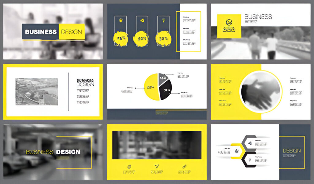
- Visual-Driven Theme: Some decks focus on minimal text and strong visuals. Each slide has a single headline and a striking image, icon, or chart in this theme. The idea is to speak more with pictures than words. For example, large icons or photos illustrate concepts, while you (the speaker) narrate. Zendesk’s Snapchat example did this: it used bold graphics and a short headline per slide【50†】. (Experts recommend “limit each slide to one main idea… avoid text-heavy slides”.) A visual theme can make your deck feel modern and engaging, but be sure each image is relevant and supports your point.
- Customer Journey Theme: Another approach is to mirror the buyer’s journey in your deck. Organize slides as stages: Awareness (the big trend/problem), Consideration (your solution), Decision (value and proof), and Action (CTA). You might even title slides after these stages. This theme shows empathy by acknowledging that the prospect is on a path. For example, your deck could start with “Meet [Customer Persona Name],” then show their discovery of the problem, encounter with other solutions (and their flaws), and finally how they chose you. This approach reinforces that you understand the customer’s viewpoint at each step. As DealHub suggests, always connect your message to what “is important to buyers”, their goals and concerns. A journey theme makes those connections explicit.
Each theme can overlap with you. For example, tell a narrative about a customer’s journey through the problem and solution. Choose the one that fits your story and stick to it so the deck feels unified. The right theme engages your specific audience and keeps them curious slide after slide.
Sales Deck Design Tips
Great content needs great design. Keep these visual tips in mind:
- Keep It Clean and Visual
Use plenty of white space and stick to one main idea per slide. Avoid text-heavy slides. Bullets shouldto-the-point. Cirrusinsight be short and to-the-point.co. A key rule is to include only what the viewer needs; fill up a slide with too much text or irrelevant info is a common mistake. Instead, use charts, diagrams, and icons to illustrate your points. For instance, if you have to show data, use a chart with an explicit callout, not raw tables. Infographics and visuals can make complex information digestible. Maintain a simple color scheme and legible fonts so nothing distracts from your message. Remember, the audience should be listening to you, not reading paragraphs off the slide. - Be Consistent With Branding
Make sure your slides look like they belong to your company. Use your brand colors, logos, and fonts consistently. A cohesive design reinforces professionalism and trust. If your brand uses blue and white, apply those colors throughout. If you have a company font or icon style, use it on every slide. Even the tone of your language should reflect your brand voice (e.g., formal vs. friendly). Consistency also means consistent slide layouts: header placement, image style, and bullet indentation should all follow one template. This way, the deck feels polished. Inconsistent design can subconsciously signal sloppiness, so resist the temptation to mix and match themes from different slide templates.
Use Storytelling Through Slides
Remember the narrative elements you included: use your slide visuals to reinforce that story. For example, if you’re telling the story of a customer, include photos or avatars of that customer persona. If you promised a “promised land,” show an aspirational image of success (like a happy customer team). Metaphors can be powerful: slidebean suggests using unexpected images to frame a concept (e.g., a puzzle piece, a lighthouse, etc.) Just be sure every image adds meaning. Also consider animating charts (reveal data points) or sequencing bullet points in your slide software to keep pace with your narration. Subtle transitions can help the viewer follow along: for instance, fading out the problem text when revealing the solution. In short, treat your slides as the next chapter of the story you began telling in your voice.
Examples of High-Performing Sales Decks

Learning from absolute sales pitch examples can spark ideas. Here are a few notable ones:
- Dropbox
Dropbox’s famous seed-round pitch deck (used to explain its product to investors) is also a great model for sales decks. It kept slides clean and mission-driven. It emphasized the goal “to make file sharing simple and accessible” rather than diving into tech jargon. Their cover slide uses the Dropbox logo and a tagline, and early slides state the problem (file sync is hard) and solution (cloud-sync anytime, anywhere). The design is straightforward: big text, few bullet points, and relevant icons. The story is clear; it starts by painting users’ frustrations and then demonstrates how Dropbox fixes them. This example shows how stating a clear mission can align the whole deck. - Zuora
Zuora’s sales deck (for its subscription billing platform) is known for its visual-rich design. According to industry watchers, Zuora “uses image-rich backgrounds and contains minimal text” to set itself apart. Each slide might have a large photo or graphic, a bold heading, and a single-sentence takeaway. For instance, one slide might show a vivid image titled “Recurring revenue has revolutionized business,” hinting at a bigger trend rather than detailing the software. The cinematic effect communicates Zuora’s vision (the shift to subscription models) along with its value, without overwhelming viewers with text. This deck illustrates how bold visuals combined with storytelling can convey value and vision in a memorable way. - Uber
Uber’s (admittedly internal) sales presentations have also been praised. Their narrative-driven decks frame Uber as part of a global change in transportation. One analysis noted that Uber “depicts the growth model of Uber, the digital revolution, and the system that solves the taxi industry’s current problems”. They often start with a big trend slide (urbanization, smartphone usage, etc.) and then tie it to Uber’s solution. Uber’s decks use catchy visuals (e.g. city maps, smartphone images) and minimal text, focusing on painting a picture of the future. The hook for solving inefficiencies in an entrenched industry is evident. The lesson here is: don’t just list features; craft a story about why your solution is timely. Uber’s approach, like Zuora’s, shows that centering a deck around a powerful narrative theme can keep slides concise yet impactful.
These examples share commonalities: clear value propositions, storytelling, and strong visuals. You don’t need to copy their style, but examining how these companies structured their messages can inspire your sales pitch examples.
Mistakes to Avoid in Sales Decks

Even an otherwise excellent product can fail if the deck is off. Watch out for these pitfalls:
- Overloading Slides With Text
Don’t fall into the trap of reading bullets off your slides. Too much text is a perennial mistake. Turtl warns that filling slides with “filler content” makes your deck seem rushed and unfocused. Instead, keep slides concise: aim for no more than 3-5 bullet points each, and preferably only one key point per slide. Use images or charts instead of paragraphs. If you catch yourself using complete sentences on a slide, try breaking it up or explaining it verbally while showing a visual. Remember, if people read your slides, they’re not listening to you. Clean, uncluttered slides look better and force you to speak clearly and directly. - Making It All About You
Your deck should focus on the customer, not on how great you are. A classic mistake is filling slides with company history, internal awards, or too much product buzz. As Turtl points out, buyers expect personalised content; they want to hear about their needs, not your org chart. Always frame things from the customer’s perspective. For example, instead of a slide titled “About Our Company,” lead with customer success or market insights. When talking features, immediately explain why the customer cares. Cirrus Insight’s advice fits here: “Focus on outcomes, not features”. In practice, this means you talk about how “they save $X” or “achieve growth”, rather than just “our product has feature Y.” Keep the spotlight on the buyer’s world and concerns. - Skipping the CTA
As tempting as it is to wrap up with your logo and a thank-you, never skip the call-to-action. Without a CTA, your deck ends on a whimper instead of a bang. Turtl’s guide flatly states it: “No compelling call-to-action” is a top mistake. Always include a final slide that tells the prospect exactly what to do next (and why they should do it). This could be “Book a free demo,” “Download a trial now,” or “Let’s set up a follow-up call.” Make the offer enticing, for instance, promise a free pilot or assessment. The goal is to capitalize on the momentum you’ve built. Think of your CTA as the finish line: it’s where the story ends, and the customer crosses over to action. Skipping it is like leaving a car in neutral and expecting it to drive itself.
Venture Care’s Sales Deck Services
You can follow every guide, read every tip, and still struggle to build a deck that closes deals. That’s why many founders and sales teams turn to experts.
Venture Care helps businesses like yours create sales decks that don’t just explain—they persuade.
Their service goes far beyond slide design. It’s about building a complete sales narrative, backed by visuals, data, and structure that align perfectly with your buyer’s journey.
Here’s how they help:
- Customer-Centric Messaging
Every deck starts with understanding your buyer. Venture Care tailors the content to speak directly to your audience’s pain points, needs, and goals. The result? Slides that feel like they were written just for them. - Proven Frameworks
They follow a clear, high-converting structure: Hook → Problem → Solution → Benefits → Proof → CTA. No guesswork. No filler. Just a logical flow that builds interest and trust. - Professional Visuals
Clean, branded design that enhances your message. They avoid overcrowded slides, heavy text, or generic stock visuals. Instead, you get focused slides that reinforce each key point. - Conversion-Focused Copy
The words on your slides matter. Venture Care writes copy that’s concise, clear, and designed to drive action. Each sentence is there for a reason—to keep your audience listening, nodding, and saying yes. - Real Support, Start to Finish
Whether you’re starting from scratch or improving an existing deck, Venture Care walks you through every step. You don’t just get a deck—you get a strategic partner who helps you tell the right story. - Adaptable to Any Industry
From tech startups to service providers, their team knows how to shape the right message for any sector. Your value gets framed in a way that makes sense for your target buyer.
Great sales decks aren’t just about design or layout. They’re about clarity, structure, and impact. Venture Care brings all three—so you walk into meetings more confident, more prepared, and more likely to close.
Final Thoughts
A winning sales deck doesn’t happen by accident. It takes strategy, creativity, and refinement. But the payoff is enormous: a well-crafted deck can turn lukewarm prospects into enthusiastic customers. Remember the key recipe we’ve outlined here: hook your audience with relevance, define their problem, introduce your solution, highlight benefits, and back it all up with proof. Keep it visually clean and consistently branded, weave a story that sticks, and never forget a clear next step. As you build or update your deck, gather feedback by running it by a mentor or testing it in a mock sales call. With each iteration, you’ll learn what resonates with your market.
Ultimately, treat your sales deck as an integral part of your product. It should embody your brand’s strengths and solve the audience’s needs, all while guiding them smoothly to action. Follow these guidelines, and your next sales presentation will be more engaging, persuasive, and likely to close.